Metadata
- Source
- STUDIO-9
- Type
- Bug
- Priority
- Major
- Status
- Closed
- Resolution
- Fixed
- Assignee
- Anastasia Cheetham
- Reporter
- Anastasia Cheetham
- Created
2011-12-07T14:50:10.923-0500 - Updated
2011-12-09T13:14:52.132-0500 - Versions
- N/A
- Fixed Versions
- N/A
- Component
-
- Website
Description
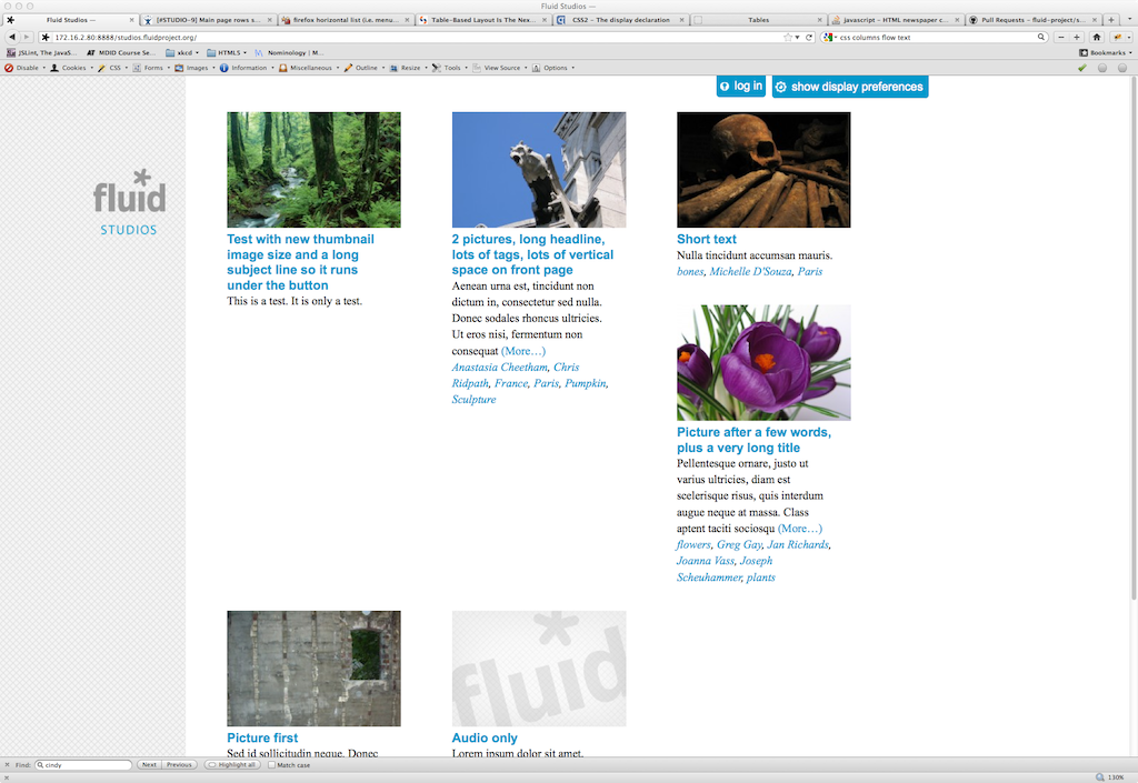
The rows of thumbnails and excerpts on the main page should have a consistent height despite differences in the amount of text. Currently, if an entry has very little text, the item underneath rises up, leaving empty space to its left.
Attachments
Comments
-
Anastasia Cheetham commented
2011-12-07T17:15:59.629-0500 The attached screen-shot (bad-columns.png) illustrates the problems that can arise with the straightforward fl-grid styling.
-
Anastasia Cheetham commented
2011-12-08T10:24:17.235-0500 It is proving difficult to find an easy solution to this one. Last night I discussed various options with James and Joanna, including alternate layouts. James expressed a desire for a quick, temporary solution if possible: limit the titles to three lines, the tags to two lines, and set a fixed height for the rows. We should investigate more responsive options asap, possibly using media queries
-
Anastasia Cheetham commented
2011-12-09T10:45:18.029-0500 Michelled merged this into the project repo at fcfdbf74863f32a608ca173d564f95095cb1500a