Metadata
- Source
- SJRK-302
- Type
- Bug
- Priority
- Major
- Status
- Open
- Resolution
- N/A
- Assignee
- N/A
- Reporter
- Gregor Moss
- Created
2019-09-26T22:04:32.393-0400 - Updated
2020-04-29T14:11:10.476-0400 - Versions
- N/A
- Fixed Versions
- N/A
- Component
-
- Storytelling Tool UI
Description
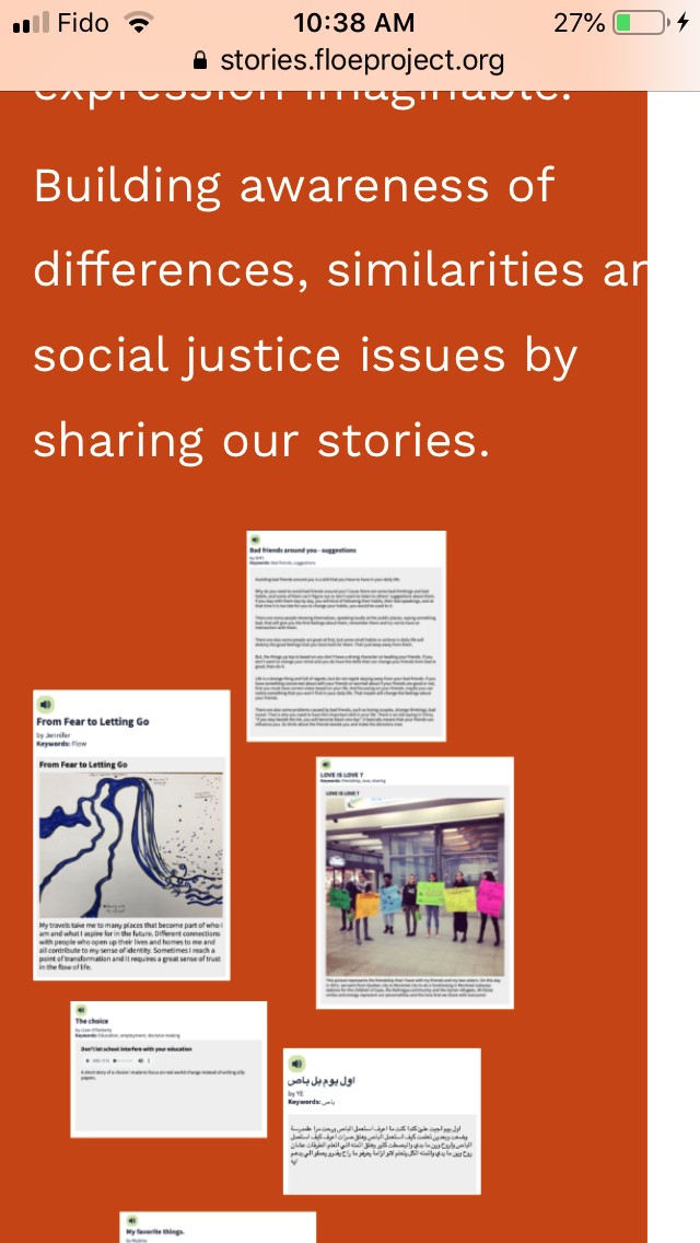
At narrow widths, particularly on an iPhone 8, the site content is pushed in from the right side and is not taking up the full width of the screen. This may be related to one or two containers (likely UIO panel) having a set minimum width while the rest of the content is able to go narrower.
Occurs on iPhone 8, but can easily be reproduced by emulating a narrow display in Chrome or other browsers' development tools
The issue can more easily be reproduced by increasing text size via UIO
Attachments

Comments
-
Gregor Moss commented
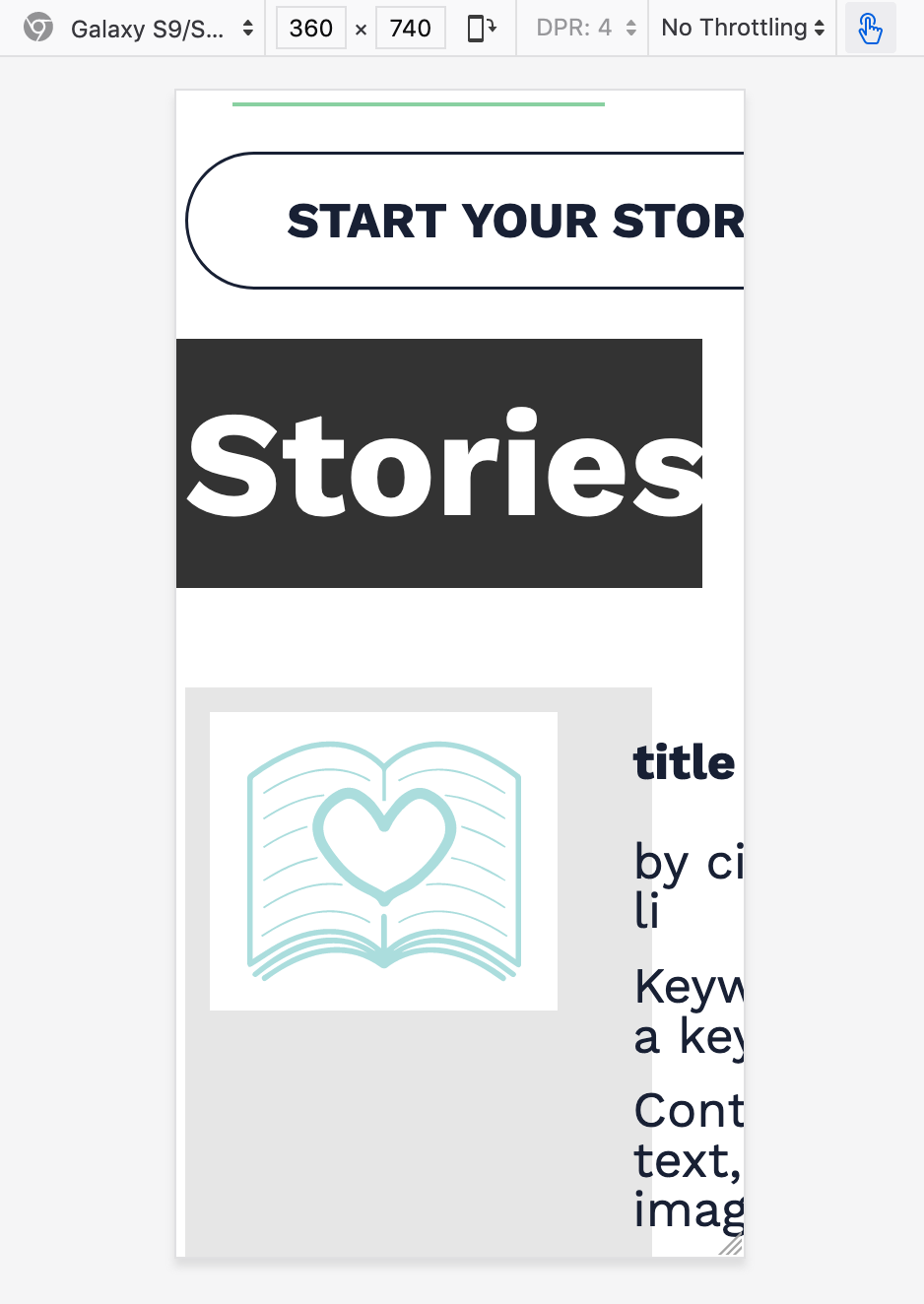
2020-04-29T14:08:28.704-0400 Issue was also reported by Cindy Li while testing the SJRK-342 pull request: https://github.com/fluid-project/sjrk-story-telling/pull/74
See the attached "2020-04-29 ST Galaxy S9 simulated background bug.png" for that instance.