Metadata
- Source
- FLUID-6616
- Type
- Improvement
- Priority
- Major
- Status
- Open
- Resolution
- N/A
- Assignee
- N/A
- Reporter
- Justin Obara
- Created
2021-05-04T14:52:47.890-0400 - Updated
2021-05-05T10:25:54.427-0400 - Versions
-
- 3.0
- Fixed Versions
- N/A
- Component
-
- Prefs Framework
- UI Options
Description
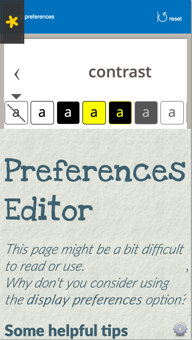
Some panels such as contrast are too wide for a narrow window/screen to display all of the contents. We currently chose to keep the size and spacing of the interactive elements to maintain usability/accessibility of touch inputs. However, this may require horizontal scrolling to see all of the options.
We should explore if modifying the size/spacing can allow for all of the elements to be visible and still easily tapped. Additionally, we can look at alternative designs that may not suffer from the same issue.
Steps to reproduce:
- Open the UI Options demo
- Use a phone in portrait, a narrow screen or responsive mode in a browser
- Open the preferences panel
- Navigate to the "contrast" panel
- Notice that the right hand side is cut off and requires horizontal scrolling to see all of the options.
Attachments
Comments
-
Justin Obara commented
2021-05-04T14:55:50.830-0400 screenshot_responsive.png shows the contrast panel in the mobile view, with the right side cut off (off screen).
-
Ned Zimmerman commented
2021-05-05T09:55:42.249-0400 It seems to me like perhaps a good approach to the contrast panel might be to make it a grid with the theme buttons wrapping onto two rows.
-
Justin Obara commented
2021-05-05T10:25:02.212-0400 We have talked about using a grid in the past. If I recall correctly the main sticking point is that the options are currently marked up as radio buttons. With a keyboard, radio buttons are typically navigated with the arrow keys; forward and down move to the next option, and back and up move to the previous. If the options are grouped in a grid it may give the impression that pressing up/down should move between the rows. If the grid layout makes more sense, we may have to consider moving away from radio buttons, but still finding something that communicates the single selection for the group of options.