Metadata
- Source
- FLUID-6525
- Type
- Bug
- Priority
- Major
- Status
- Closed
- Resolution
- Fixed
- Assignee
- N/A
- Reporter
- Justin Obara
- Created
2020-07-02T15:55:48.166-0400 - Updated
2020-07-15T13:37:50.930-0400 - Versions
- N/A
- Fixed Versions
- N/A
- Component
-
- Prefs Framework
- UIEnhancer
- UI Options
Description
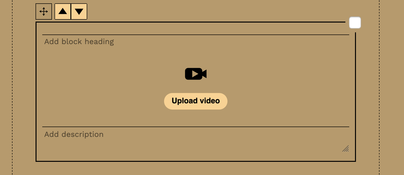
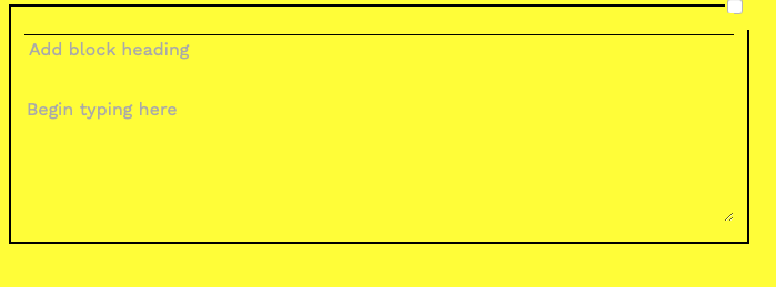
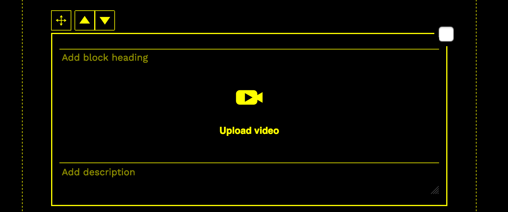
The contrast themes do not style placeholder text. Placeholder text already has low contrast but when used with some contrast themes it is almost completely unreadable.
The placeholder text can be styled using the placeholder pseudo element.
https://developer.mozilla.org/en-US/docs/Web/CSS/::placeholder
Attachments

Comments
-
Justin Obara commented
2020-07-02T15:57:50.503-0400 "placeholder text with black on brown theme.png" shows the low contrast between the placeholder text and the background in the black-on-brown theme.
-
Justin Obara commented
2020-07-02T16:01:19.315-0400 Dana do you have any thoughts on how we might best address styling for placeholder text when the contrast themes are applied?
-
Dana commented
2020-07-06T14:51:49.157-0400 Justin Obara Deleted previous comment because I think I misunderstood what you were describing. The black on brown theme is not a low-contrast theme, so the placeholder text should still pass for contrast, is that right? Using #363636 is as light as we can go for the placeholder text on the brown background (B69A6D) and still pass WCAG AA for normal-sized text, so we could try that.
-
Justin Obara commented
2020-07-06T15:28:38.054-0400 Added another example "black-on-yellow_placeholder_text.png".
-
Justin Obara commented
2020-07-06T15:30:33.909-0400 Dana I guess the basic issue is that we do not style the placeholder text at all at the moment. So it always shows up in the browser default styling. I'm not exactly sure how to best handle it for the binary contrast themes like black-on-yellow, where we only use two colours. It would be hard to distinguish the placeholder text from the other text on the page. In the case of black-on-brown, that is a theme that using several colours so adjusting the colour to something that has better contrast but doesn't look like the rest of the text on screen might be fine.
-
Dana commented
2020-07-06T16:00:31.693-0400 thanks Justin Obara and sorry I missed that screen shot attachment the first time. Firefox seems to be doing something different than what you're seeing, I've attached a few screenshots. What browser are you using?
-
Justin Obara commented
2020-07-06T16:14:56.232-0400 Dana I was testing with Safari. The screenshots you posted gave me an idea. We could implement a similar behaviour across browsers by setting the colour of the placeholder and then specifying a lower opacity. Here is a jsFiddle with a quick example. https://jsfiddle.net/j15gyedp/ You can adjust the colour and opacity values to experiment.
-
Dana commented
2020-07-07T11:51:57.076-0400 Thanks Justin Obara I think that's a great idea. I'll do some testing with the UIO contrast theme colours.
-
Cindy Li commented
2020-07-15T13:37:47.242-0400 The pull request that fixes this issue has been merged into the project repo master branch at this commit.