Metadata
- Source
- FLUID-6376
- Type
- Improvement
- Priority
- Major
- Status
- Closed
- Resolution
- Migrated
- Assignee
- N/A
- Reporter
- Jonathan Hung
- Created
2019-04-29T15:50:48.014-0400 - Updated
2022-03-14T13:46:57.728-0400 - Versions
- N/A
- Fixed Versions
- N/A
- Component
-
- Tech. Documentation
Description
The Infusion Docs site lacks any responsive design making it hard to use on mobile devices.
For example, resizing the browser causes the top-level navigation to wrap onto white space causing the text to be illegible.
Attachments
.jpg)
Comments
-
YashJipkate commented
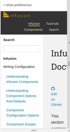
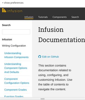
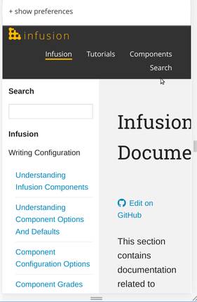
2020-04-08T03:40:51.148-0400 I have tried to fix a part of this by making the top-level navigation responsive. Here are some screenshots:
Desktop (Full screen - no breakpoint - current default behaviour):
Breakpoint 1:
Breakpoint 2:
Breakpoint 3:
I would like to get feedback from the community on the screenshots I provided above. Please let me know if there are any changes that need to be made in the design. If they look good, I would like to send a Pull Request to the infusion-docs repo proposing my changes.
Thanks!
-
Justin Obara commented
2022-03-14T13:46:57.712-0400 Migrated to Infusion-Docs Issue #226