Metadata
- Source
- FLUID-4770
- Type
- Bug
- Priority
- Major
- Status
- Reopened
- Resolution
- N/A
- Assignee
- N/A
- Reporter
- Anastasia Cheetham
- Created
2012-08-15T15:57:55.969-0400 - Updated
2018-09-17T20:57:33.337-0400 - Versions
-
- 1.4
- 1.5
- 2.0
- Fixed Versions
- N/A
- Component
-
- Uploader
Description
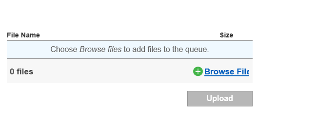
When the last file is remove from the queue (via mouse or keyboard), when the "Add More" changes back to "Browse Files," the "Browse Files" button is positioned too far to the right, so it extends outside the main area. Hovering over it will move it back to the right place.
Environments
IE9, IE 11
Safari 10 ( macOS 10.12 )
Attachments
Comments
-
Neel Dalsania commented
2016-03-07T12:21:27.399-0500 pull request: https://github.com/fluid-project/infusion/pull/680
-
Justin Obara commented
2016-03-09T11:13:34.036-0500 screenshot.png shows the "Browse Files" button clipped on the right side.
-
Akshay Agarwal commented
2016-03-14T14:59:15.596-0400 As per what I could see, the width of the button is not big enough to hold the text.
Adding the code below to the uploader.css in the demo(https://github.com/fluid-project/infusion/blob/master/demos/uploader/css/uploader.css) could be a temporary fix and this makes the uploader demo work fine.
.fl-uploader-browse {
width:8em;
}.fl-uploader-browse.fl-uploader-browseMore {
width: 7em;
}Remove these two stylesheet references from index.html inside the uploader demo and it would be fine without the above code too.
<link rel="stylesheet" type="text/css" href="../../src/lib/normalize/css/normalize.css" />
<link rel="stylesheet" type="text/css" href="../lib/foundation/css/foundation.css" />So, this is only a temporary fix because change in the text size would again make the text disappear out of the button area. So the width of the button should be dynamically adjusted as per the text or the text inside button should be conforming to the button size.
I have to look more properly at the normalise .css and foundaion.css code to understand this better.