Metadata
- Source
- FLOE-261
- Type
- Task
- Priority
- Major
- Status
- Closed
- Resolution
- Fixed
- Assignee
- Anastasia Cheetham
- Reporter
- Anastasia Cheetham
- Created
2015-02-05T16:22:04.845-0500 - Updated
2015-11-03T11:18:39.373-0500 - Versions
- N/A
- Fixed Versions
- N/A
- Component
-
- First Discovery
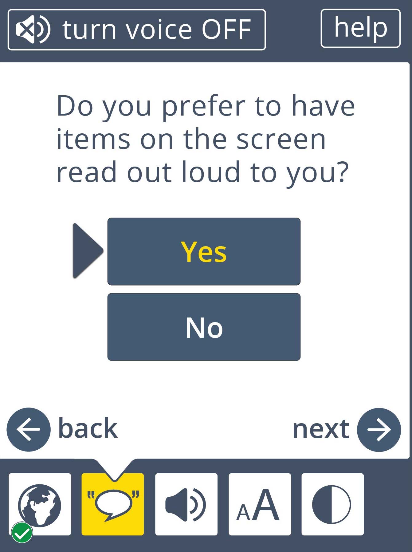
Description
Dana's comments on the UI as of Feb. 5:
- progress checkmark vertical alignment should be 1/2-way inside and outside the icon boxes (see wireframes). horizontal alignment is good.
- make yellow indicator arrow dark blue, bigger, and closer to box (see attached)
- move bottom icons down a bit (center them vertically) so the space between the main white box and the icons is big enough for the pointer arrow
- make the pointer arrow almost touch the icon boxes
- as discussed minimum text size should still show some fill in the progress bar
- maximum text size in the progress bar should still have a white internal border
- yes/no buttons on TTS page should be fatter (see wireframes)
- add min/max labels on top and bottom of progress bar (see wireframes)
- change text size icon and speech icon (once I get font icons to you!!)
Attachments
Comments
-
Anastasia Cheetham commented
2015-02-05T16:48:32.421-0500 Other fixes:
- ensure a consistent height across all screens
- the contrast screen layout is off