Metadata
- Source
- CITY-16
- Type
- Bug
- Priority
- Major
- Status
- Done
- Resolution
- Done
- Assignee
- Avtar Gill
- Reporter
- Simon Bates
- Created
2018-07-25T10:41:30.261-0400 - Updated
2018-09-19T10:36:00.610-0400 - Versions
- N/A
- Fixed Versions
- N/A
- Component
- N/A
Description
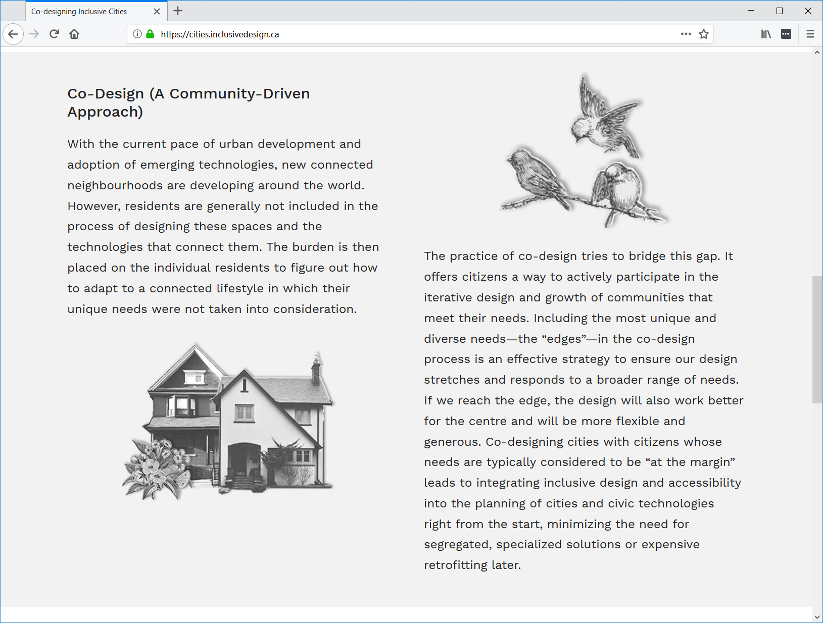
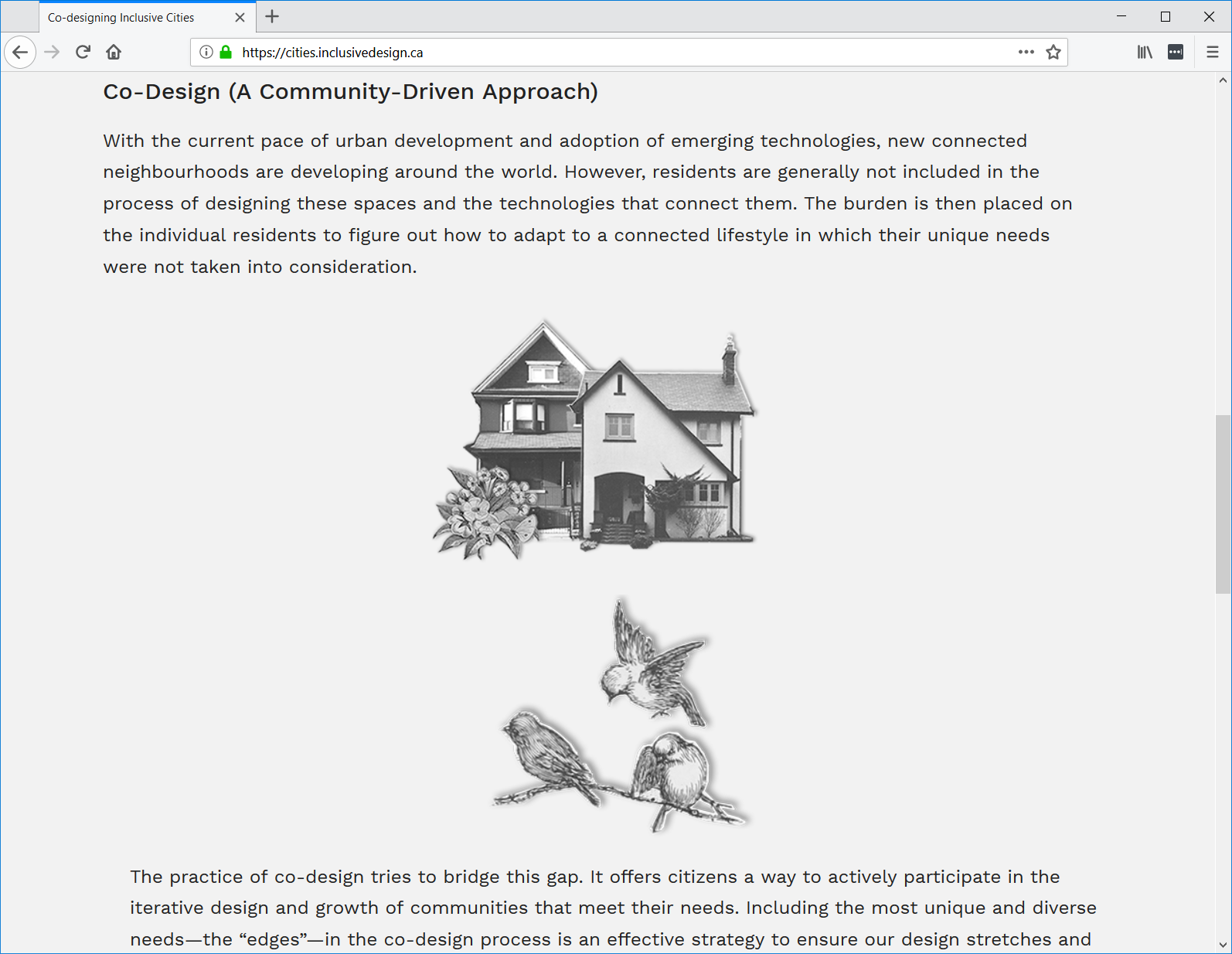
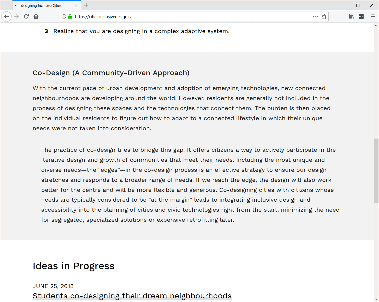
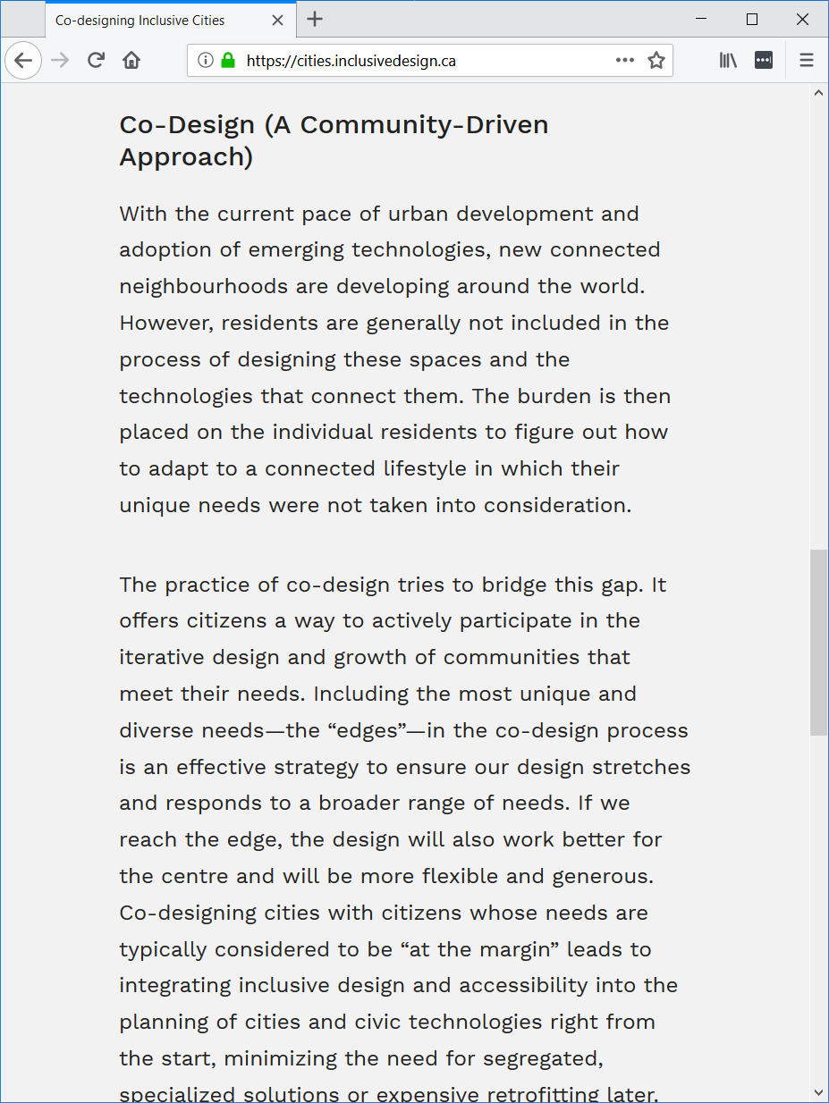
We have 4 renderings (viewed on Firefox on Windows 10) of the "Co-Design (A Community-Driven Approach)" section of the website visible at different browser window widths:
- (1) At widest: Text paragraphs and images are displayed in a 2x2 grid layout with images beside the text (attached image "Images beside.png")
- (2) Text paragraphs and images stacked vertically. With the text paragraphs not aligned (attached image "Images stacked - text not aligned.png")
- (3) No images and text not aligned (attached image "No images - text not aligned.png")
- (4) At narrowest: No images and text aligned (attached image "No images - text aligned.png")
Renderings (1) and (4) are good but (2) and (3) have text alignment issues. And (2) wastes a lot of vertical space with the images. With my usual browser width and display settings, (2) is what I see by default (rather than (1)) which is not ideal.
Maybe we can remove (2) and (3) and jump between (1) and (4)?