Metadata
- Source
- C2LC-554
- Type
- Bug
- Priority
- N/A
- Status
- To Do
- Resolution
- N/A
- Assignee
- N/A
- Reporter
- Tony Atkins [RtF]
- Created
2021-12-01T09:29:20.669-0500 - Updated
2024-04-29T10:00:21.143-0400 - Versions
- N/A
- Fixed Versions
- N/A
- Component
-
- Coding Environment
Description
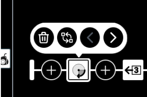
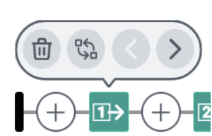
In the dark theme, the contrast between the disabled gray caret (#9da4af) and the button background (#4C9990) is: 1.33:1
In the contrast theme, the contrast between the disabled gray caret (#505862) and the button background (#000) is: 2.91:1 (it also fails with #1E1E1E).
In the light theme, the contrast between the disabled gray caret (#f1f2f4) and the button background (#d5d8dd) is: 1.27:1
The greyscale theme is intentionally low contrast.
This does not seem to be related to recent colour changes, I see the same issues in the default/mixed themes in production.
Attachments

Comments
-
Simon Bates commented
2024-04-29T10:00:20.932-0400 Moved to GitHub: https://github.com/codelearncreate/c2lc-coding-environment/issues/485