Metadata
- Source
- C2LC-526
- Type
- Bug
- Priority
- N/A
- Status
- To Do
- Resolution
- N/A
- Assignee
- N/A
- Reporter
- Michelle D'Souza
- Created
2021-10-13T17:10:55.225-0400 - Updated
2024-04-30T11:39:08.351-0400 - Versions
- N/A
- Fixed Versions
- N/A
- Component
-
- Coding Environment
Description
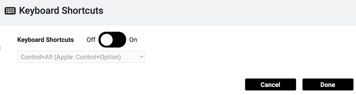
Focus applies a black border around the toggle button, when its outer colour is black.
Attachments
Comments
-
Daniel Cho commented
2021-10-21T11:16:01.197-0400 We have design in Figma for the focus style for the toggle switches.
-
Tony Atkins [RtF] commented
2021-11-03T05:19:27.654-0400 Maybe I'm looking in the wrong place, but the contrast theme mockups on the Design System page in Figma don't match the current design for more than just focus, and there are a few things left to the imagination. For example:
- The "off" and "on" styles for the audio toggle (which appears against a black background) are not correct.
- The "off" and "on" styles for the pen down (which appears against a black background) are inverted.
- The "off" and "on" styles for the expand add nodes toggle (which appears against a white background) are also inverted.
- The focus examples only show "on" buttons, it's not clear what to do for "off" buttons for both white and black backgrounds.
We should review with Sepi to clarify.
I also noticed that the hover styles for IconButton are wrong, which I will open a separate ticket for.
-
Simon Bates commented
2024-04-22T15:22:13.330-0400 This is still an issue but is specific to the toggle switch on the Keyboard Shortcuts modal. The styling for the toggle switches on the Sound Options modal is different.
-
Simon Bates commented
2024-04-30T11:39:08.351-0400 Moved to GitHub: https://github.com/codelearncreate/c2lc-coding-environment/issues/496