Metadata
- Source
- C2LC-289
- Type
- New Feature
- Priority
- N/A
- Status
- Done
- Resolution
- N/A
- Assignee
- N/A
- Created
2021-01-25T13:39:33.234-0500 - Updated
2021-03-30T16:17:05.808-0400 - Versions
- N/A
- Fixed Versions
-
- Coding Env 0.7
- Component
-
- Coding Environment
Description
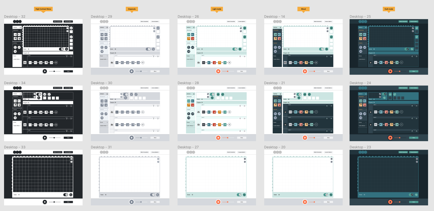
Ability to change the colours of the coding environment
- mixed (default)
- light view
- dark view
- monocolour
- high-contrast
Notes:
- The theme will be selected using a Theme selector menu, as for 0.6, but with the new colour themes (rather than Forest and Space)
Attachments
Comments
-
Michelle D'Souza commented
2021-01-26T10:30:14.947-0500 Sepideh Shahi will have designs by the end of this week.
-
Sepideh Shahi commented
2021-01-27T09:14:07.653-0500 Colour themes are ready: https://www.figma.com/file/5msi8IMap0LFe0XLFS9QKW/C2LC-Design-System?node-id=95%3A443
-
Tony Atkins [RtF] commented
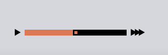
2021-03-02T04:32:37.912-0500 I am working my way through this, but wanted to comment here on an issue that Daniel and I have been researching. The speed controls are currently based on an HTML range input. Although there are options for styling the thumb and slider, these ultimately cannot be use to realise the desired look. In short, the main working approach to displaying one colour on the left and another on the right relies on a large box shadow to the side of the thumbnail, which moves with the thumbnail. The problem is the shape of the shadow is affected by the shape of the element itself, so that you end up with a giant circular shadow. If you use overflow-y to hide this, the thumbnail icon itself is also cropped. The closest we can get is a design with the right colours but the wrong shape (a square thumb control):
This falls short of the desired design in a number of ways. Daniel and I have discussed converting this to a custom component instead, which I will investigate. With that, we would be able to achieve the speed slider design as specified including all colour variations.